How to Set Up a Lab Wizard Cloud Dashboard | Lab Wizard
Table of Contents
How to Set Up a Lab Wizard Cloud Dashboard
Lab Wizard Cloud Dashboards give you live visual insight into production performance, alerts, and key process metrics, all without coding. The drag and drop dashboard builder lets you design layouts for customized reporting.
⚡ Accessing the Dashboard Builder
- Navigate to Menu → Setup → Dashboards.
- Click Create Dashboard.

⚡ Step-by-Step Dashboard Creation
1. Name and Describe Your Dashboard
Give your dashboard a clear name and description so others understand its purpose.
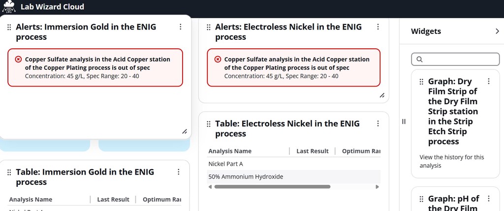
2. Add Widgets
- Widgets appear in the right panel.
- Drag and drop them onto the left canvas.
- Resize horizontally or vertically to fit your display needs.

3. Understand Widget Naming
Widgets follow the format:type:resource
Example: Graph: Dry Film Strip of the Dry Film Strip station in the Strip Etch Strip process
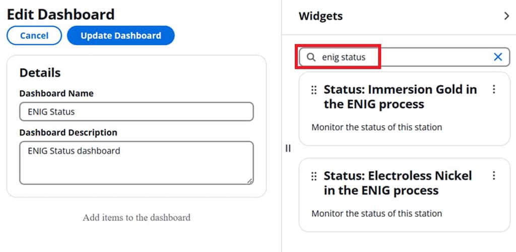
4. Filter Widgets
Use the search bar to quickly find what you need.
Example: typing enig status filters all matching widgets with enig and status in the widget name, in this case we have a process named ENIG and all Status widget types for this process are displayed. NOTE: All widget types with those search strings in the widget name will be returned.

5. Arrange and Resize
Position widgets where you want them, and resize into the canvas alignment blocks as needed. You can always adjust later using the dashboard builder.

6. Save and View Live Data
While editing in the dashboard builder, widgets show sample content, not live data. Save your dashboard, then view it under Menu → Dashboards to see live data.
7. Share Your Dashboard
Copy the browser URL from Menu → Dashboards to share with your team or display on manufacturing floor monitors. NOTE: To view the dashboards, a user with appropriate permissions must first sign into Lab Wizard Cloud and be logged into the site where the dashboard was created. A service account with read only access is often used for this purpose.
⚡ Dashboard Widget Types
Graph
Shows trends for the last 30 data points of a specific analysis, with:
- Blue dashed target line
- Yellow dashed optimal limits
- Red dashed spec limits
- Out-of-spec points highlighted in red

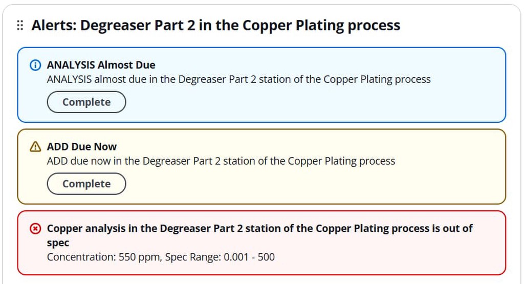
Alerts
Displays active alerts for a station, color-coded by priority (red, yellow, blue), with direct links to resolve them.

Table
Lists the latest analysis results for each configured analysis on a station, plus optimal and spec ranges.

Status
Summarizes all status events for a station, including:
- Out of spec
- Out of control
- Almost due / Due / Overdue additions, makeups, analyses

⚡ Best Practices for Dashboard Design
- Start Small – Add only essential widgets first.
- Group Logically – Place related metrics together.
- Use Filtering – Quickly locate widgets by keyword.
- Design for the Screen – Ensure readability for monitor/TV display.
- Review and Update – Adapt your dashboards as process needs evolve.
⚡ Example Dashboard Setups
- Production Monitoring: Graphs + Alerts for critical KPIs in one view.
- Quality Control: Table widgets for parameter checks with matching Status widgets.
- Shift Handover: Alerts + Status widgets on one screen for quick team updates.
🚀 Coming Soon
Planned enhancements include:
- Custom refresh intervals
- Additional widget types (inventory, tasks, etc.)
- Dark mode dashboard views
